
0 Comments
Below is the list of articles I have decided to put in my table of contents (the one underlined is what my 2 page spread will be about)
 I like this layout for the table of contents because it is very simple yet still has a nice pop of color. This will help match my cover because I want to emphasize on the simpleness of this magazine to make readers feel more at ease. I also like the use of the same color choices, they used fall colors like oranges which is similar to what I want to do do with green and orange/red for my magazine. I also like how unique the vertical writing is. There is also pictures of the food in the magazine which I think serves as decoration and as insight to the articles. This will be helpful so readers can find the food they want to make and the page easily.  I chose this layout because I love the colors and pictures. I can imagine having my images on it of what will be in my magazine. This table of contents also used similar colors (green, orange, and red) that I want to use on my cover and throughout my magazine. The geometric layout where pictures and words are not always just straight is very eye catching and creative, it once again engages readers. Similar to the first layout, I find this one rather simple where it just has pictures and words but, this one is a little more filling to the pages which may work better for me. 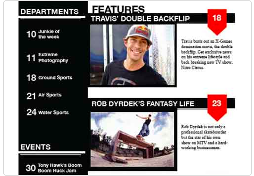 Like the other layouts, the simpleness of this one also appealed to me. I wasn't a fan of the dark colors they used in this example but, I think it is a very easy change where I can match it to my cover to make it fit better. I really like how it lists all articles on one side, then puts two articles on the other side much bigger. I think this is a smart way to draw people to the main articles and give them a picture as a preview so, it helps emphasize my main articles. Possible article topics:
 In the masthead, you can see the title of my magazine “Stuffed”. This word literally means to be filled to the top. It suggests that this article is about food because oftentimes people use the word stuffed to describe themselves after they have had a good big meal which is what my magazine helps you do. The typography on my magazine cover creates a calming mood with the fonts and colors. By using only two simple fonts it remains easy on the eyes and easy to read. The colors are also very minimal with whites, greens, and oranges to keep it simple. They are arranged by size in the order of importance, the bigger the font is the more important the word or phrase is. The words are also on the edges to form around the image. The image on the magazine cover is a close-up picture of a bowl of ramen noodles. This relates to the topic of the magazine, ramen, while also drawing the attention of people who like cooking and ramen. The bowl is also light in the front with a blurred background to really focus on the bowl. The language of this cover is once again very simple and basic for people to read. This suggests to readers that this magazine will make cooking simple for them which makes it more likely that beginners will be buying this. The magazine strapline is “Simple Tips, Real Results” which suggests that the magazine will give cooking tips, recipes, and ideas to help improve your cooking and dishes. The magazine cover relies on using short phrases so the reader still feels calm and like this magazine will be easy for them to read. Like said before, the words are ordered in importance based on the size of the font to draw attention to the main parts of the magazine that we want to sell the people on. It also tells about the articles inside from the most important ones to the little ones. Overall the different parts of this magazine are there to emphasize the simple-ness of this magazine to show that the tips will help make cooking easier.
 Differences between my notes and the candidate response:
Similarities between my response write up and the candidate response:
|
