|
This is what my table of contents looks like when I add my college picture. I need to get two more. 
0 Comments
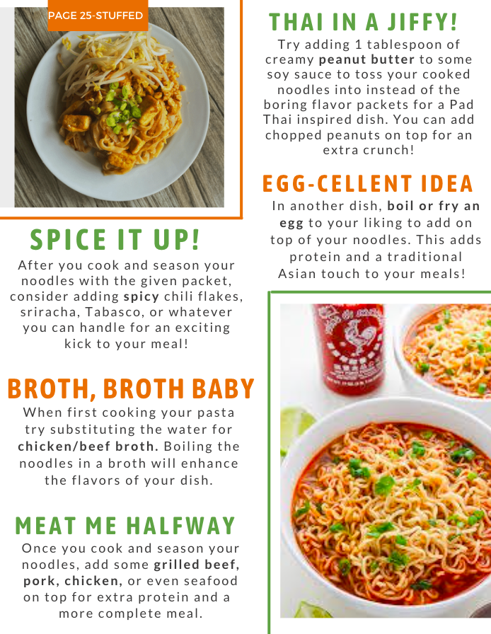
I am going to use VSCO to darken the picture a little and turn up the saturation so the yellow flag sticks out more. Below is the edited version.  I decided that for one of the images on my table of contents where the article is about college friendly recipes I would use a picture from the college I am going to, University of Central Florida. I took a picture from when I visited and am going to add it in. 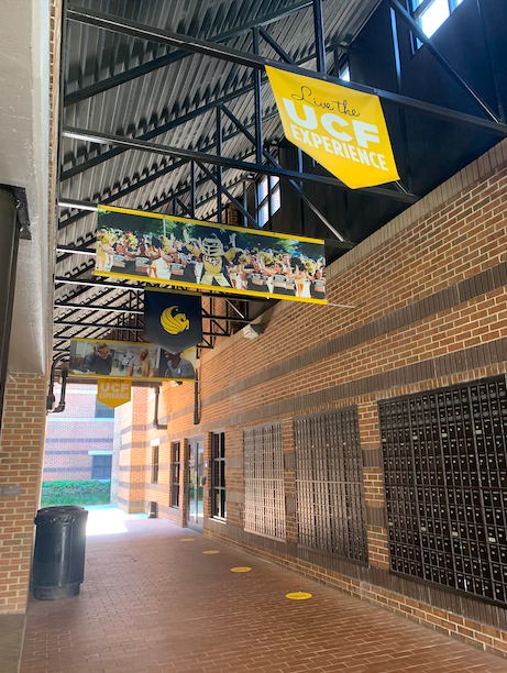 I tried to find the perfect picture to use for my last on the the two page spread on the bottom right, I knew the picture I wanted and could not recreate it. I looked online for other images but, I just keep going back to my original picture I put in as inspiration. I really liked how well the picture fit with the sizing and colors and even how the green onions on top complimented the green box around the picture so, I decided to keep that image since I liked the layout so much with it in there. Source for Sriracha Ramen on 2 Page-SpreadI found this image online on a cooking blog called "Baker by Nature" The picture was posted along with a recipe made by Ashely who is a chef and food photographer, she posted this recipe and image on September 25, 2014 LINK: https://bakerbynature.com/20-minute-spicy-sriracha-ramen-noodle-soup/ 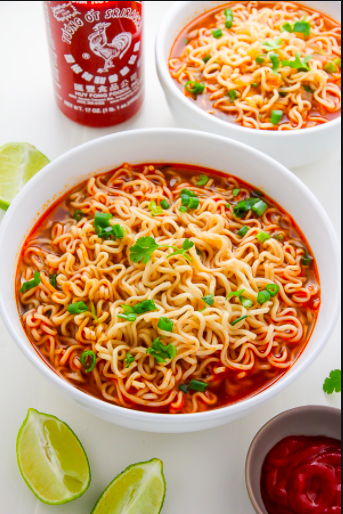 I did another back and forth on whether to go with the white background or dark grey on my 2-page spread since I made them both and liked them but, I decided to go with the white one. This one is brighter and matches more with the oranges and brighter colors on the other page. The white also allows the text and pictures to stick out more on the page and look cleaner. Below is the final draft I will be using.  After my previous decisions on placements and colors, this is what my 2-page spread looks like together.
After giving it a few days, I have decided that I am going to keep the original placement of the orange squares. When I moved it up it covered the tomato which brought a nice pop of color that I do not want to hide. Below is the draft I will be keeping. 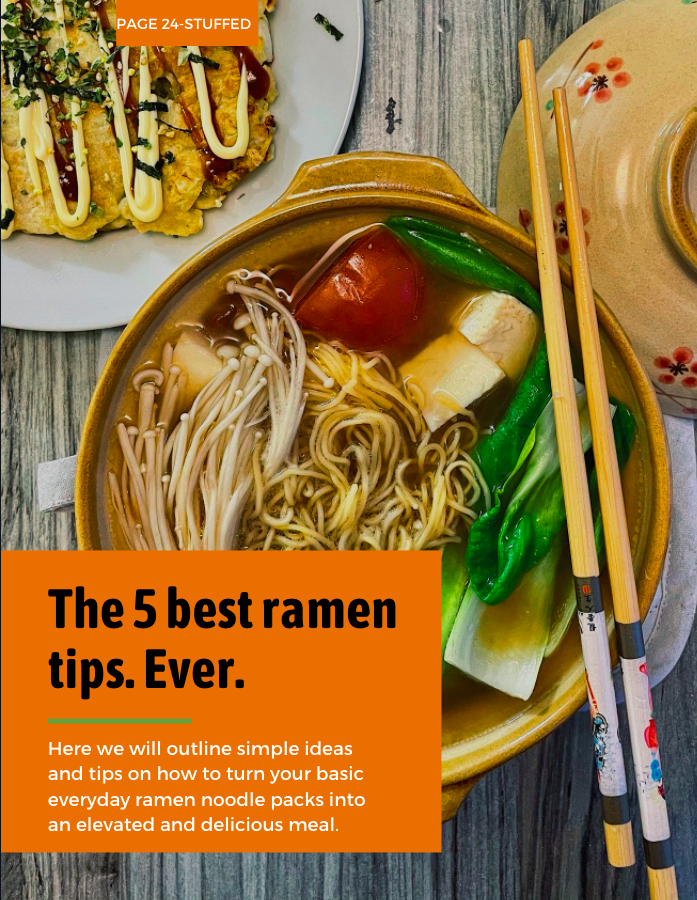 Like in my last post, I added the other edited picture to the second side of my two page spread. This was a smaller image added to the corner. I had to slightly edit the words around it to look better but, nothing too major. Once I added in this picture I was once again very happy with the page. I was going to switch the color of the boxes around the pictures but, I actually liked how the orange box highlighted the noodle color so I left it as it was.  Since I liked the picture so much with the orange box I tried moving the boxes around on the page to see different layouts. I moved the title up and the page number down and the whole page looks different. I like the changes but, I will need to decide which I like the most.  Since I have my edited pictures for my two page spread I have started adding the pictures in and adjusting the format. I did the article title page first and it looks great! The colors from the tomato, broth, and the bowls look great with the orange box I already put to write the title. I am really happy with the turn out and do not think there are much more changes that need to be made to this page.  |